hola. hi. salaam.
SanaMente:mental health care, on your terms.
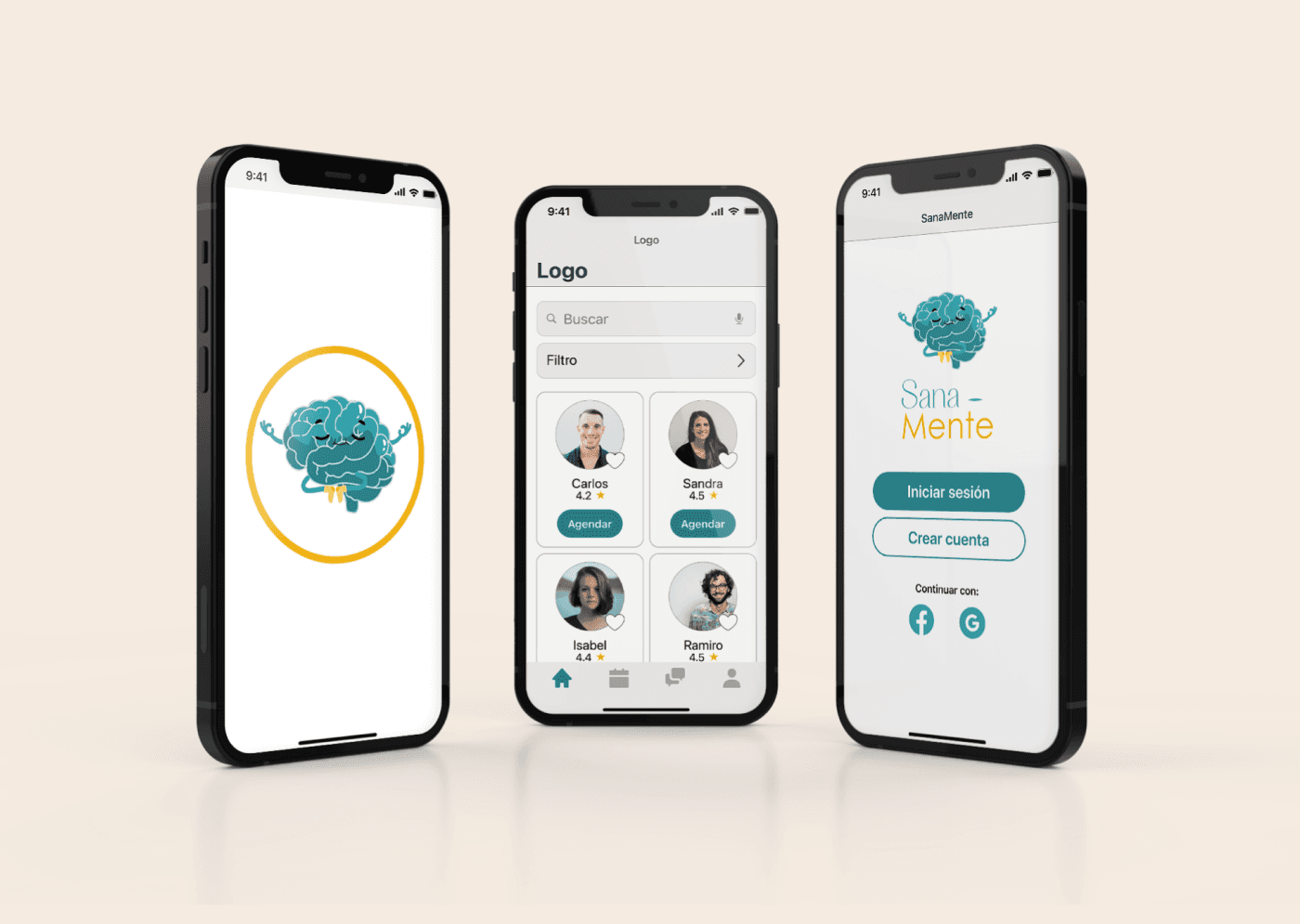
A native mobile app that helps people in Colombia find, book, and pay a mental health professional in real time. Built around what actually keeps people from getting help: confusing referrals, mismatched specialties, schedules that never line up, and pricing you only see after you commit.
Role
UX/UI designer
Timeline
8 weeks, 2022
Team
Solo
Client
Academic project
Deliverable
iOS native app, prototyped in Figma

context
The problem
After the pandemic, anxiety and depression in Colombia jumped 25 percent (World Health Organization). Search Google Trends for ansiedad or depresión in Colombia and you can watch the spike happen in real time around late 2019.
25%
rise in anxiety and depression in Colombia after the pandemic
But the path to care is a maze. Most Colombians have three options: go through their EPS (public health insurer), pay out of pocket at a private clinic, or rely on a personal recommendation. The EPS route requires a general practitioner referral that often gets blocked by internal filters. Private options exist but you cannot compare them in any meaningful way. And the people who need help most often have the least bandwidth to navigate any of it.
63.7%
of Colombian heads of household reported emotional symptoms tied to mental health (2021 government survey)
~14M
Colombians aged 18 to 49 in the target audience for this app
If the goal is mental health, the path to get there shouldn't be the thing causing more stress.
users
Who I was designing for
I interviewed people who had either started looking for therapy or were already in it, and built two primary personas from the patterns.
Sandra, 24, Medellín
Commercial advisor with long hours and aggressive sales targets.
Pablo, 35, Bogotá
Biomedical engineer, married, has been to two therapists before and never clicked with either.
Different starting points, same blocker: no easy way to see who's available, what they specialize in, and whether they're the right fit.
market
What the market was missing
I benchmarked four apps closely: Terapify, Psonrie, BetterHelp, and iFeel. I also studied Preply, a language tutoring app, for its onboarding patterns. Reading their app store reviews surfaced the same complaints again and again.
01
Hidden costs
02
Match without context
03
Filters that don't filter what matters
04
Registration walls
decisions
The decisions I made
I scoped tight. Four essentials, four nice to haves. Search with real filters, appointment booking, in app messaging, and clear professional profiles were the must haves. Anything that didn't directly serve a first time user finding and booking a therapist got pushed to a later phase.
I ran an open card sort with target users on Optimal Workshop. They grouped twenty cards into five clusters that became the app's IA: Search (filters, advanced search), Schedule (date, time, duration, price), Information (academic background, focus, experience, ratings), Learning (recommended books, podcasts, meditation), and Communication (call, video call, chat). One surprise: users grouped “Price” with appointment duration, not with payment, because the cost varies based on how long the session is. I followed their logic.
design
The design
Final UI uses Spanish labels (Agendar, Filtro, Buscar, Perfil del psicólogo) since users are in Colombia. Warm visual language to counter the clinical feel of most healthcare apps. Microinteractions throughout: the filter sliding in, the favorites heart filling on tap, the calendar dimming the background, payment progress states. Each one confirms a state change so the user knows the app heard them.
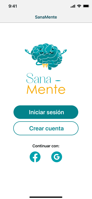
Login. Minimal entry, no full sign up wall before the search.
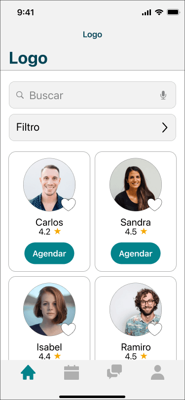
Home. Search bar with real filters leads the screen, professional cards follow.
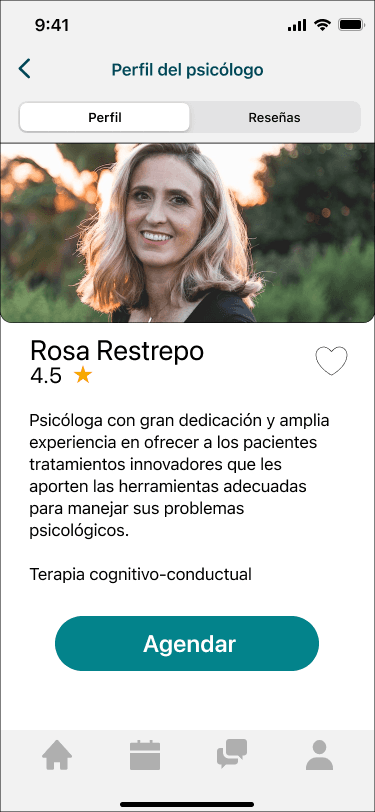
Professional profile. Approach, specialization, language, schedule, price.
More screens available in the live prototype.
what testing broke
Five participants, low fidelity prototype, conducted over Google Meet.
Task 1
Book any appointment with no preferences.
Task 2
Find a therapist who matches a specific therapeutic approach.
100%
task completion across both tasks
2:55
average time on task 1
0:54
average time on task 2
All five users completed both tasks. The first task ran longer because users were scanning the interface for the first time. By task two, they moved through the flow much faster. The interesting findings weren't the numbers. They were what testers said out loud.
- The random match button got zero clicks. I had a pick a professional for me shortcut on the home screen. Nobody used it. People want to choose, not be matched. I replaced it with the search bar.
- Bottom nav was missing on inner screens. Users got stuck. Fixed by making it persistent.
- No way to hide filters. Once opened, the filter panel stayed open forever. Small thing, big annoyance. Added a collapse.
- The prototype forced one path, but users wanted to explore. Several testers tried to take their own route through the app and got blocked because I had only prototyped the happy path. Lesson learned: prototype branches, not just the main flow.
I also added reviews to professional profiles, a help section, in app messaging, more payment options, and price as a filter criterion based on what testers asked for.
what I caught myself missing
After the user tests, I ran a heuristic evaluation on my own prototype against Nielsen's ten usability heuristics. Five of them failed.
- Visibility of system state. No indication of which step of booking you're on.
- Error prevention. No validation messages anywhere.
- Error recovery. No error states designed at all.
- Flexibility and efficiency. No shortcuts for returning users.
- Help and documentation. No help section or FAQ.
Most of these were straightforward to add in the next iteration. The point isn't that I missed them. The point is that running the heuristic eval on my own work caught problems that the user tests didn't surface, because the tests followed a script and the heuristics don't. Both methods, not one.
reflection
What I'd do differently now
Three years on and a lot of work in real healthcare later, here's what I'd change.
01
Price transparency from screen one
02
Crisis resources built in
03
Test the bilingual case
04