hola. hi. salaam.
Designing a sharing experience that feels intentional
Rethinking how iPhone users share contact info, so the experience feels safe, intentional, and fully in their control.
Role
UX Designer
Timeline
4 weeks
Team
Solo
Client
Academic project
Deliverable
UX redesign and interactive prototype
context
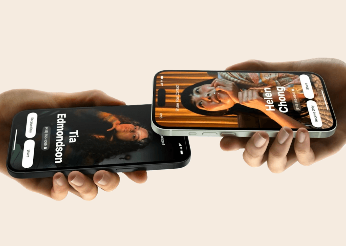
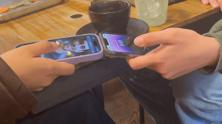
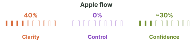
NameDrop overshares contact info, triggers accidentally, and leaves users without clear control
NameDrop launched as a quick way to swap contact info by holding two iPhones together. In practice, users described it as unpredictable, unclear, and difficult to trust. Many turned it off entirely.
I pulled 88 user comments from Reddit and the Apple Support Forum spanning the last two years. The pattern was loud and consistent.
61%
of user comments online about NameDrop are negative
34%
of complaints involve accidental activation
20%
cite a lack of control over which fields get shared
88
user comments analyzed across Reddit and Apple Support
7,366
forum views on a single NameDrop complaint thread
148
me too votes on the same thread
JohnFromNepean, Apple Support Community
discover
The people most affected by NameDrop share contact info constantly, in contexts where mistakes are expensive
jobs to be done
Across the dataset, the same kinds of people kept surfacing in complaint threads. Their work depends on smooth, accurate sharing, and they pay the highest price when the flow misfires.
constraints
Three constraints shaped what a redesign could realistically deliver for these users.
define
A wireflow review surfaced where the existing flow breaks down
wireflow review
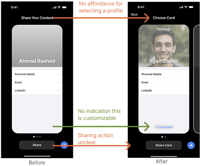
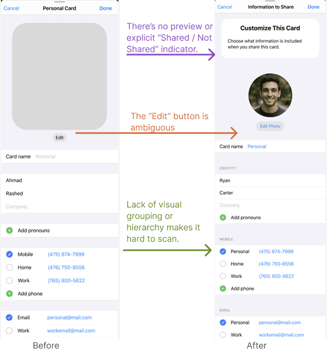
Before sketching anything new, I walked through the current NameDrop flow screen by screen. The problems were not subtle. Controls were hidden, naming was inconsistent, and the most important screen in the flow was the one most users never saw.
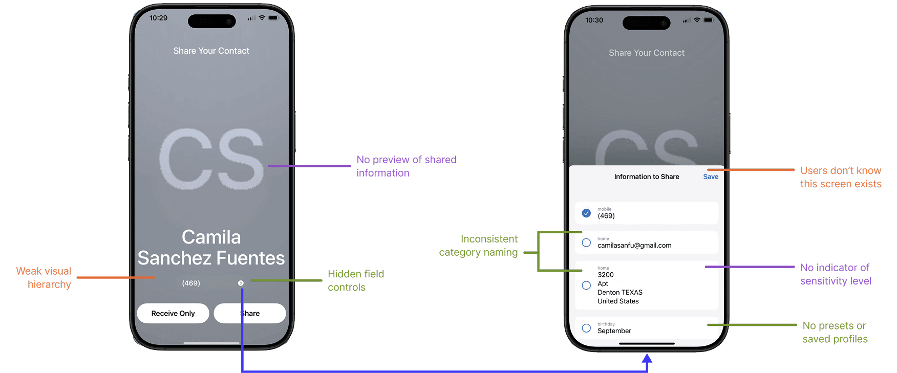
Six issues showed up across the two screens. No preview of what gets shared. Hidden field controls. Inconsistent category naming. No indicator of sensitivity. Weak visual hierarchy. No presets or saved profiles.
How might we give users simple, predictable control over what they share so NameDrop feels safe, intentional, and effortless?
develop
Twenty four sketches narrowed down to one cohesive sharing flow
crazy 8s
I ran Crazy 8s across three themes. Personalize sharing, increase clarity, and simplify decision making. Twenty four ideas total. I plotted each one on an impact versus feasibility matrix and pulled the ten that landed in the top right quadrant.
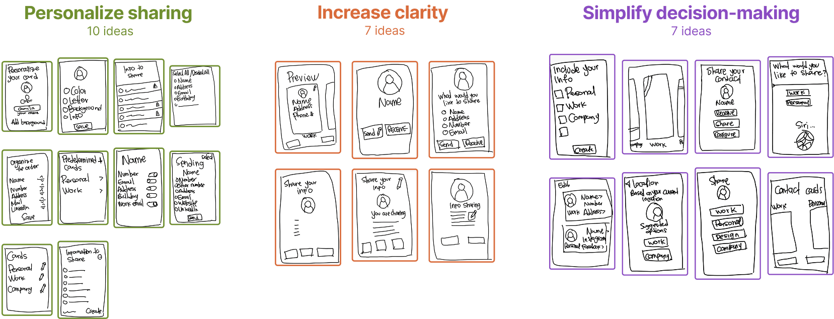
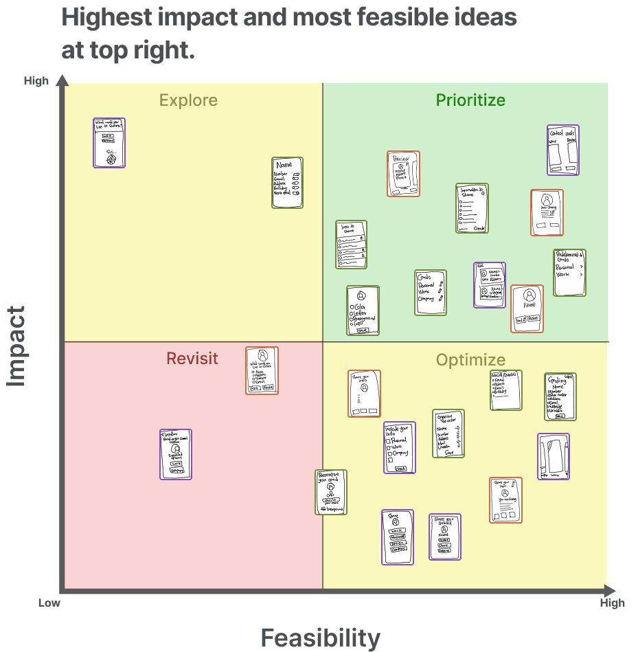
Those ten concepts grouped into three design directions, each tied to one of the user groups carrying the most pain.
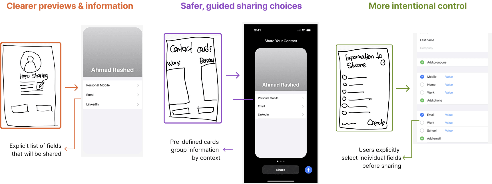
Try the full flow in the interactive prototype.
deliver
Three rounds of testing measured clarity, completion, and confidence
I ran a cognitive walkthrough before testing to catch the obvious problems, then validated the redesigned flow against the current Apple version with three small studies. A usability test, an A/B test, and a first click test.
before testing
The cognitive walkthrough flagged moments that felt confusing, risky, or easy to get wrong. I rewrote labels, added missing affordances, and clarified the share action before any user touched the prototype.
what testing showed
outcomes
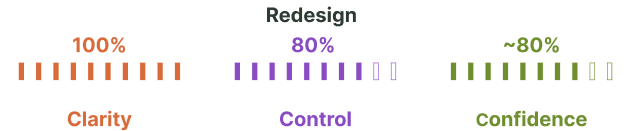
- 100 percent first step accuracy. Every user tapped Choose Card instantly in the first click test.
- 60 percent reduction in confusion. Users moved through the share step smoothly across A/B and usability sessions.
- 80 percent task completion. Most users completed the full flow without assistance.
- 40 percent to 100 percent clarity improvement. All A/B test users understood exactly what would be shared in the redesigned flow.
reflect
Three takeaways carried over from the work
what I learned
Sharing stopped feeling like a guess and started feeling like a decision.